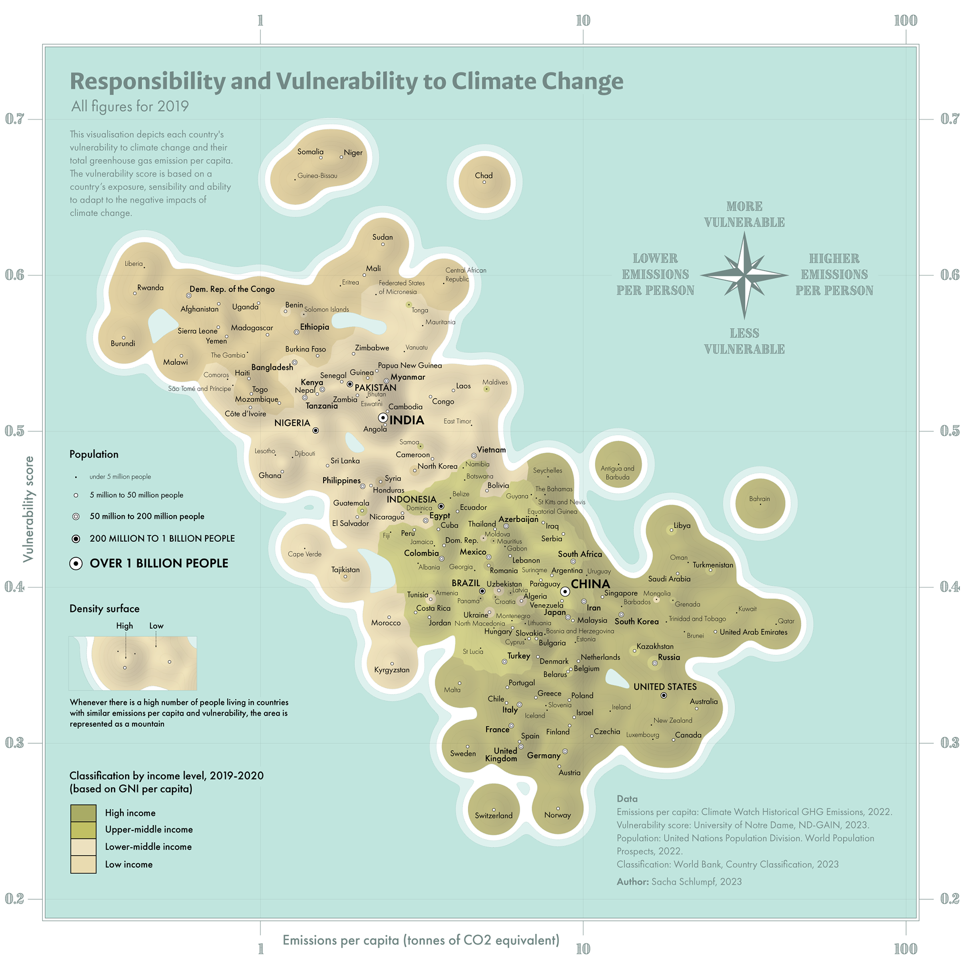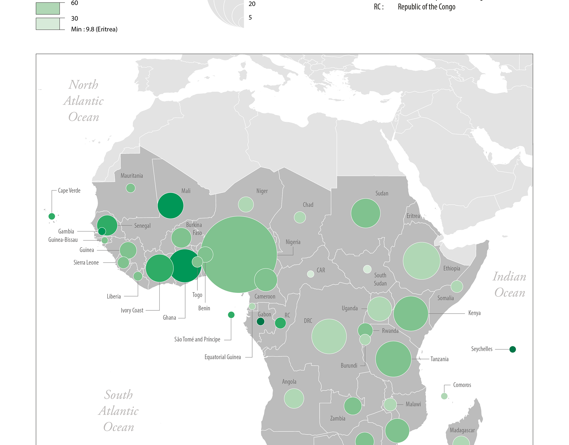
Our society is facing an immense climate crisis. Not all countries are equally responsible, and above all, not all countries will suffer the same consequences.
Using the concept of 'map imitation', I have created this visualization representing all the countries of the world, whose positions are determined by their respective responsibility and vulnerability. The colours show the wealth of the countries. The trend is clear: rich countries tend to pollute more and are less vulnerable than poor countries.
This 'map' was produced as part of my master's thesis at the Vienna University of Technology, in collaboration with HarperCollins Publishers, who are publishing a modified version of this visualization in the 16th edition of the Comprehensive Times Atlas of the World.
Tools: Python | GIS | Illustrator
Format: A3
Context: Master's thesis | Book publishing