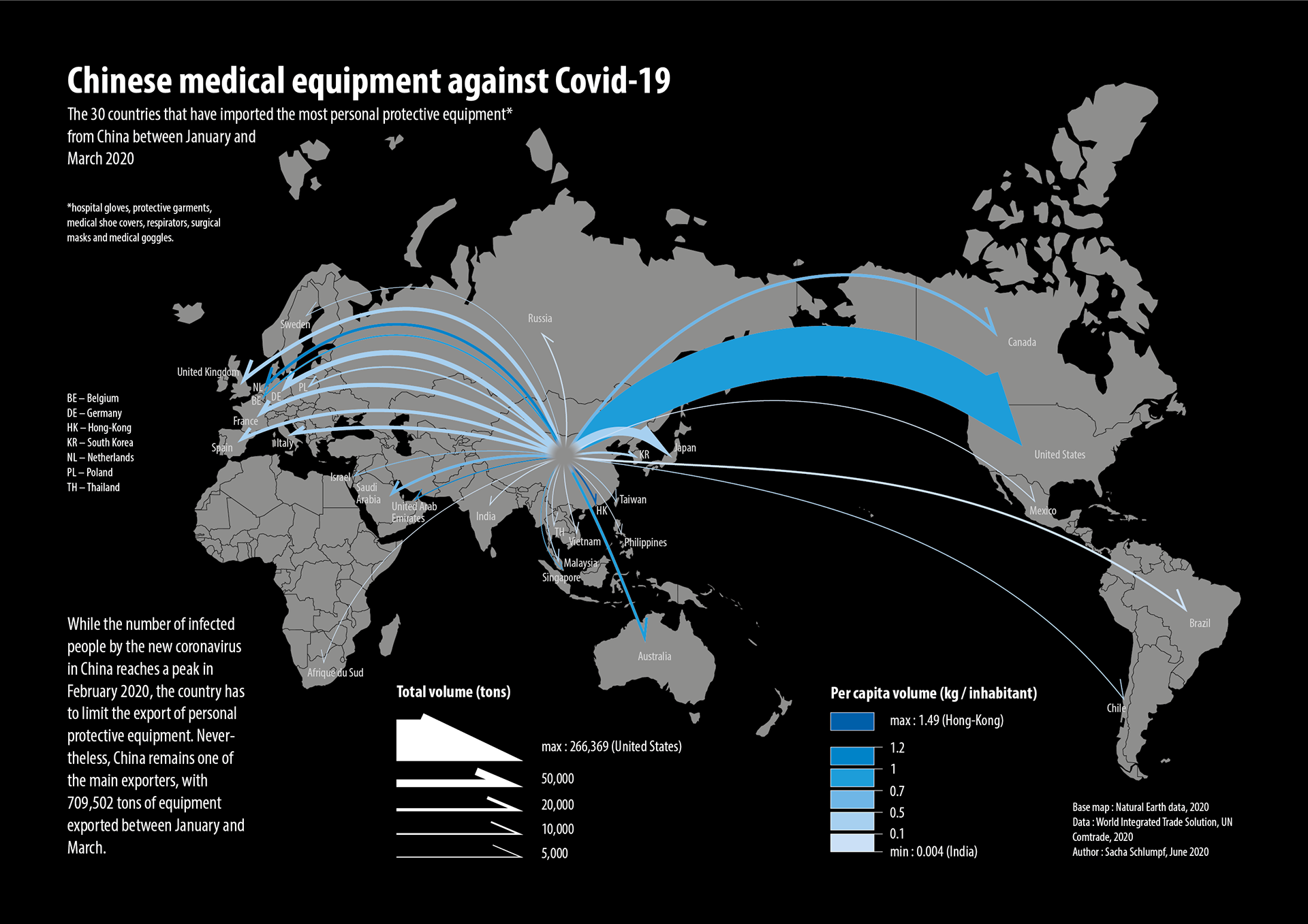
While the evolution of the Covid-19 pandemic was still very uncertain, I made this map visualising the 30 countries where China exported the most personal protective equipment during a critical period: January to March 2020.
Making a flow map that shows both absolute and relative values was a design challenge. In the end, the coloured arrows on a black background are clear and eye-catching!
Tools: QGIS | Illustrator
Format: A4
Context: Academic work (University of Lausanne)